
The Land App: messaging and website copy
How The Land App reimagined their message for a wider audience
Sustainability, tech, land management
Content type
Messaging, website copy
Goals
To create a website that reflects the brand’s evolution
To target an increased number of specialised audiences
Results
A website that positioned Land App for their next steps as a brand
UX copy that guides each user to the information they need
“To any client you can say, go and have a look at the website, and you can be confident that they’re going to find what they need.”
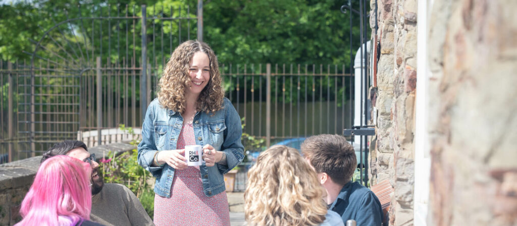
Tom Pearson, Communications & Marketing Lead
The digital mapping tool that became a movement
The Land App is an online mapping tool designed for land managers and their advisors, uniting data, advice and incentives in a nifty cloud-based platform.
Since their launch in 2015, Land App has grown to be trusted by over 4,000 rural teams and professionals across the UK, including big name land agents like Savills, land managers such as RSPB, and government agencies such as National Parks.
It’s fair to say though, that the purpose of the app had evolved beyond its initial boundaries.
At first it was simply an extremely useful tool to make sustainable land management easier. By the time The Land App team came to us, however, they were looking to facilitate connection between supply and demand in natural capital markets.
As a result, the website was out of date and no longer fit for purpose. Relaunching it, though, would not be a simple task.

The challenge
Jumping the communication gap between specialist and audience
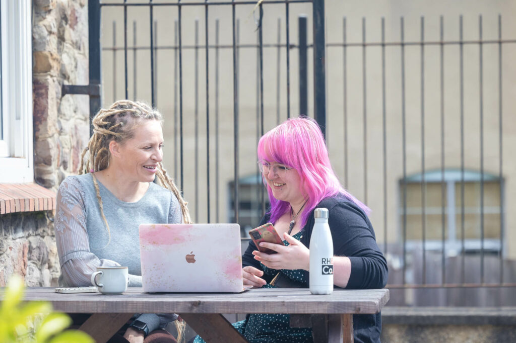
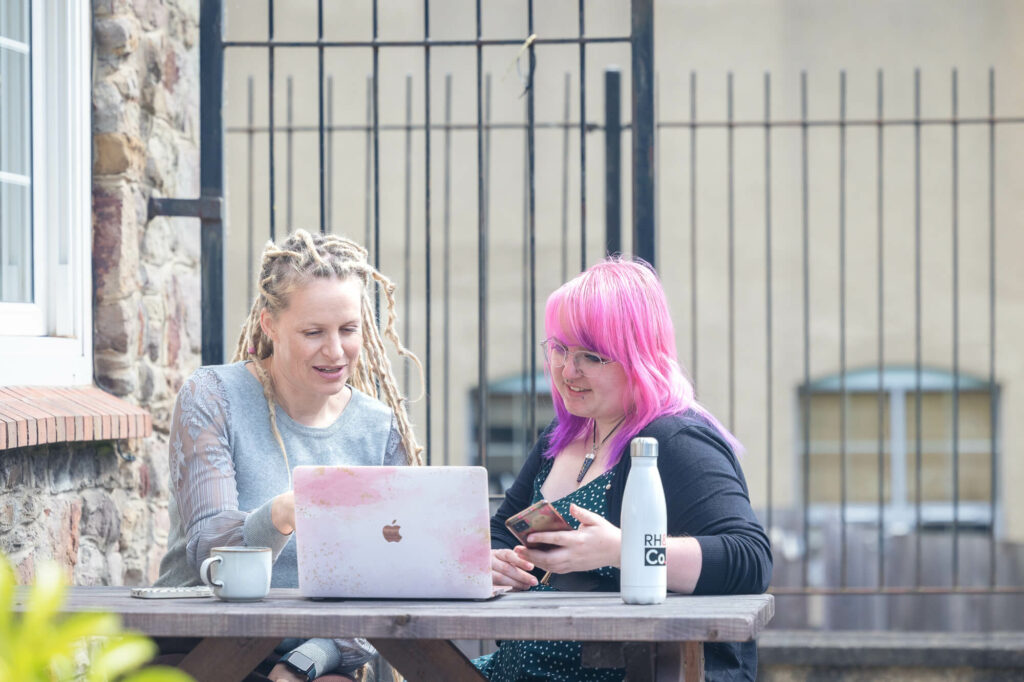
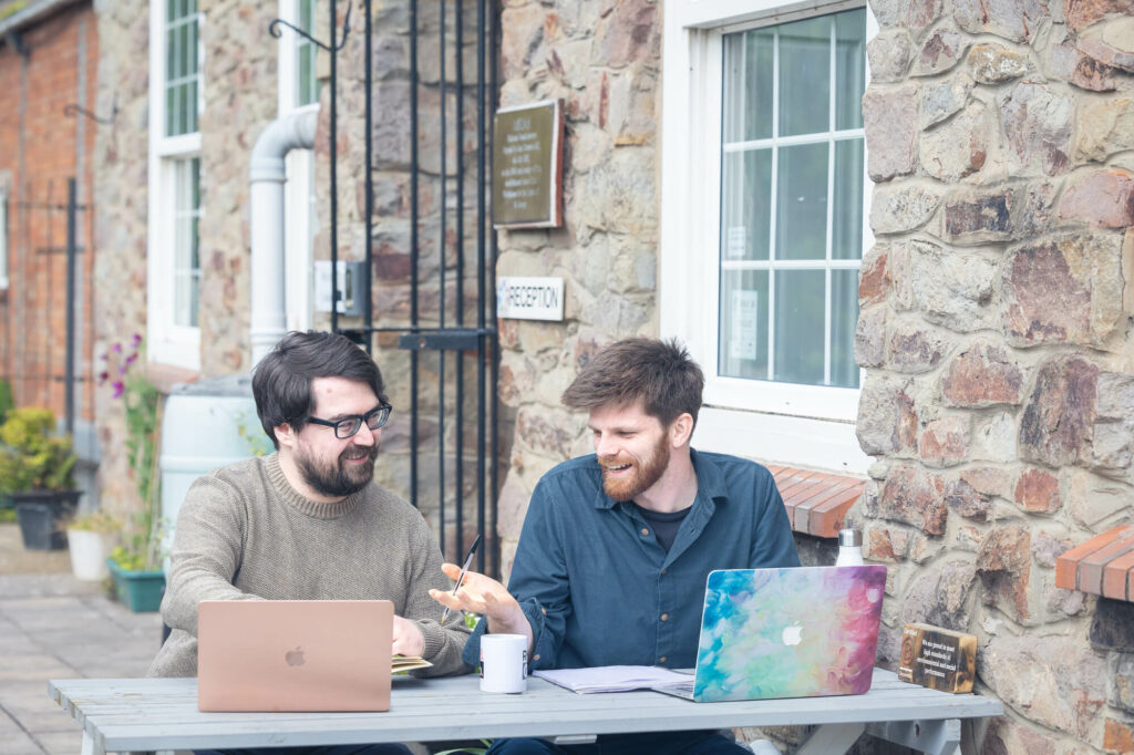
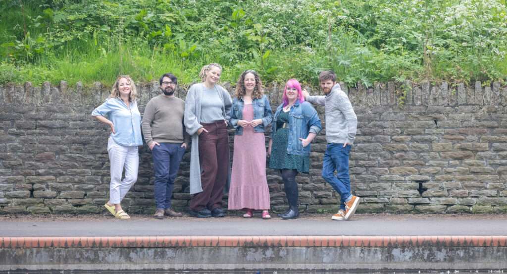
The Land App team is made of experts who each bring specialist knowledge to the table – from land management to permaculture, conservation and data analysis – and who are passionate advocates of their platform. But because everyone was so deep into their work, it was difficult to think objectively about their communication.
“Up to now, it’s been the founders trying to do everything themselves,” says Tom Pearson, Communications and Marketing Lead at The Land App. “But sometimes you need to step back and ask, are people understanding this? We have this rich, deep insight into what we’re doing, but how does that translate?”

The challenge
Targeting a wide spectrum of audiences
The Land App is an impressive tool designed for many types of specialist users. The trouble is that all of these users each have their own needs, and The Land App team were unsure of how to distil their message down through so many different channels on one website.
“You could have an ecologist that’s using the platform for a habitat assessment, a surveyor doing someone’s building extension, or a land agent who’s completing a cropping plan,” says Tom.
“This makes the messaging really tricky to get your head around, because you want to appeal to all of these people. We could have funnelled people into a hundred different categories, but we also needed to distil the message without excluding anyone.”
The solution
An iterative approach
Working alongside the design team at Garrett Creative, we began by interviewing The Land App’s team so that we could scratch beneath the surface to unearth the heart of their product. From this we created a document that presented our initial ideas so The Land App could begin to give us feedback about the language and messaging – while Garrett Creative did the same thing with their visual messaging. After this we could run with their thoughts, mock up a couple of website pages, and receive feedback again before creating the entire site’s copy.
“The team are all so invested in the platform and the website,” says Tom. “It’s our baby and we wanted to make sure it was right. So it was really good to have these iterative drafts, to be able to comment along the way or have a call, listen to what you guys were saying, and make sure we were saying the right thing.”
The Land App saw this not only as a process that they were going to get great output from, but also as a learning exercise. It forced them to answer questions, such as who is using the platform? How can we streamline that without leaving anyone out? And how can we keep from overloading users with too much information?
Outcomes:
A message that speaks to everyone
Through our collaborative process, we found a way to present easily accessible information so that a surveyor, an ecologist, a farmer, an estate manager and a land agent could instantly see why they needed the platform. “To any potential client you can now say, ‘go and have a look at the website,’” says Tom, “and you can be confident that they’re going to find what they need.”
A website that positions the brand to go higher
While The Land App weren’t hiding their website before, they definitely weren’t flaunting it as a resource. That changed after the rewrite. “We now have this fantastic website which we can use as a trampoline,” Tom says. “It elevates everything.”