


3 forgotten website pages that can make all the difference
We all know the main types of pages your average website is made up of, right? There’s the home page, of course, which we always say should act a bit like the cover of a magazine. Then there’s the About page, where you can talk a bit about your story, your team, your values and so on.
Next you’ve got what you may consider to be the most important page or pages – those that feature your products and services. This is where you can tell people all about what it is you can offer them, how you can solve their problems and meet their needs.
You’ll also probably want to stick a blog page in there (or perhaps you’ll call it news or resources) and a contacts page of course. And then, that’s it. You’re done. Or are you?
In fact there are three other pages you would do well to think about in order to make your website really sing.
The thank you page
Have you got any forms on your website? Perhaps there’s one asking your visitors to sign up to your newsletter. Or maybe you’ve created a few lead magnets to encourage visitors to give you their email address in exchange for a really valuable piece of content.
If you have even one form, here’s a question for you – what happens after your visitor enters their contact details and hits ‘submit’? Are they taken to a bland page that says “Thank you for getting in touch” and leaves it at that? If so, you’re missing a trick.
If someone has just parted with their contact details, it means they’re interested in you – in your brand, in your expertise, in your value. So why not use the thank you page to serve them more of the same?
Keep them on your website and boost your dwell time by directing them to an interesting and relevant blog post, for example. Or highlight a low cost product or service that might augment the free resource they’ve just subscribed to and see whether you can make a sale. Whatever you do, don’t leave them hanging.
“No matter how careful you are about finding and fixing broken links, chances are one will slip through the cracks at some point.”
The FAQs page
One of the biggest issues we see on websites that haven’t been written by professional copywriters is too much information. Business owners are so keen to explain every last detail of their product, service, processes and USPs that they fill each page with overwhelming amounts of text.
A far better option is to create an FAQs page. Your visitors will expect this page to be text heavy. And because that text will be broken down into the various different questions, they won’t be overwhelmed by it. They’ll be able to scan to find the question they’re interested in and then just read that short answer.
FAQs are also excellent for SEO. In very basic terms, Google looks at your H1 and H2 headers and subheads first, before looking at body copy. So this is where you want to have a good amount of keywords and phrases. And an FAQs page naturally has loads of H2 subheads, which will contain relevant keywords without feeling forced.
Those subheads will also be phrased as questions, which are becoming increasingly important as the way we search changes. Where you might once have typed “copywriter” and “job description” into Google, now you might ask Alexa, “What does a copywriter do?” – and if your FAQs page asks and answers this question, you’ve got more chance of being seen.
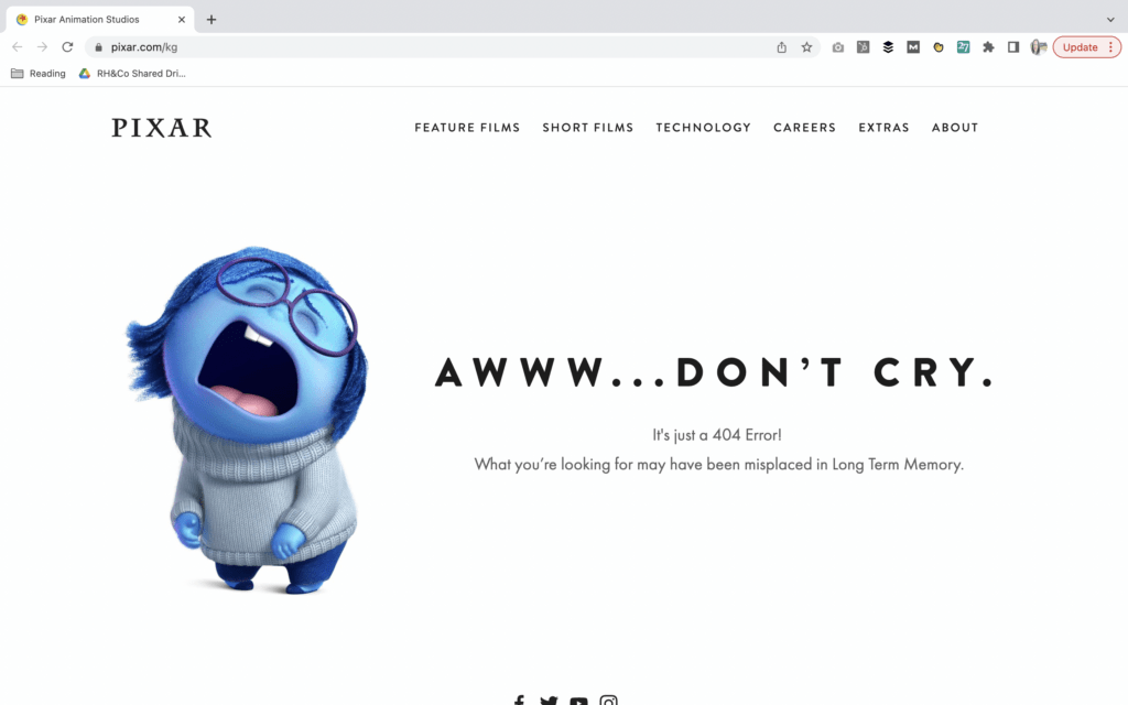
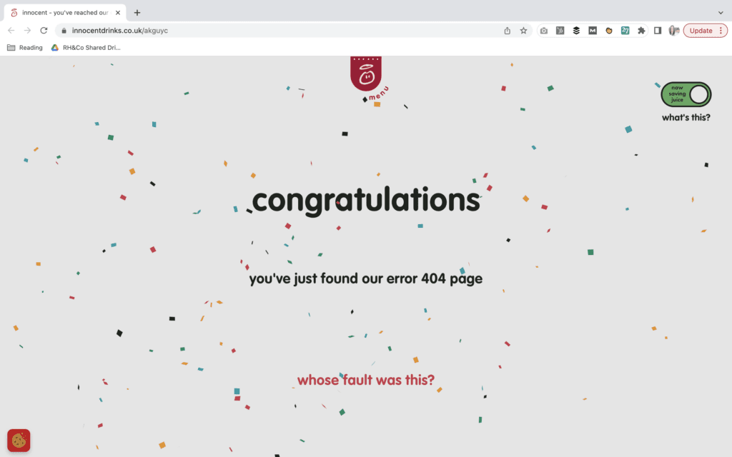
The error page
No matter how careful you are about finding and fixing broken links, chances are one will slip through the cracks at some point. So what happens when someone clicks on one of those links?
Do they get a standard, soulless 404 error message written and designed by whoever your website is hosted with? Why not a branded error message that reflects your brand personality and tone of voice instead?
Not only is this sort of attention to detail the kind of thing that will make you stand out from the crowd, it will make your audience smile at the very moment when they could be getting frustrated.
Check out these awesome examples from Pixar and Innocent Smoothies if you want to see how to write an error page with style:
The thank you page, FAQs page and error page might feel like ‘extras’ that are not worth spending the time on. But in a crowded marketplace with not just hundreds but potentially thousands of competitors online, sometimes it’s the extras that make all the difference.
Back to hompeage